图像优化
图像优化是指减少表示图像的字节数的过程。图像尺寸越小,它在页面上的加载速度就越快。图像尺寸越小,它消耗的带宽就越少。它消耗的带宽越少,用户体验就越好,尤其是在移动网络上。
响应式图像
Qwik 支持响应式图像。
这是一个内置功能,它依赖于 vite-imagetools 模块,因此无需安装任何额外的包或组件。
工作原理
- 从
src文件夹导入任何图像 - 图像被转换为多个 webp 图像,每个断点一个(200px、400px、600px、800px、1200px)
- 图像被处理并优化以减小其尺寸
- 使用
srcset属性渲染一个<img>元素,为多个分辨率设置图像源 - 现在浏览器将为正在使用的分辨率加载最合适的图像
关键点
社区和 Qwik 团队喜欢这个 API 有很多原因
- 零运行时,零 JS
- 默认情况下零道具,简单的 API
- 零 404,强类型 API
- 零布局重排(自动宽度/高度)
- 哈希图像,不可变缓存
- 自动
.webp/.avif格式优化 - 自动
srcSet生成 - 可扩展(使用任何
<img>属性) - 默认情况下延迟加载和异步解码
- 轻量级,HTML 中只有一个
<img>节点
用法
在导入的末尾添加 ?jsx 后缀
import Image from '[IMAGE_PATH]?jsx';在模板中将图像用作组件
<Image />结果
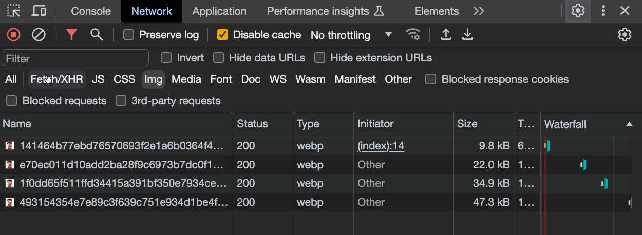
此脚本将生成以下 <img> 元素
<img

  decoding="async"
  loading="lazy"
  srcset="
    /@imagetools/141464b77ebd76570693f2e1a6b0364f4b4feea7 200w,
    /@imagetools/e70ec011d10add2ba28f9c6973b7dc0f11894307 400w,
    /@imagetools/1f0dd65f511ffd34415a391bf350e7934ce496a1 600w,
    /@imagetools/493154354e7e89c3f639c751e934d1be4fc05827 800w,
    /@imagetools/324867f8f1af03474a17a9d19035e28a4c241aa1 1200w"
  width="1200"
  height="1200"
>注意:您也可以通过手动设置这些属性的值来更改默认行为
<Image decoding="sync" loading="eager" />
由于 srcset 属性,浏览器将为设备的分辨率加载最合适的图像
原始源大小为 1.5Mb,但现在其大小仅为几 KB
示例
import { component$ } from '@builder.io/qwik';
import Image from '~/media/your_image.png?jsx';

export default component$(() => {
  return (
    <div>
      <Image />
    </div>
  );
});
自定义图像 width 和 height
您可能需要为图像设置自定义 width
<Image style={{ width: '300px'}} />但在这种情况下,您还需要手动指定 height 以避免其被拉伸
<Image style={{ width: '300px', height: '200px'}} />下面您可以看到一个简单的技巧,可以避免手动设置 height,同时保持纵横比
提示:您应该始终指定
width和height值以防止布局重排
import { component$ } from '@builder.io/qwik';
import Image from '~/media/emote.png?jsx';

export default component$(() => {
  return (
    <>
      <h1>Image Example</h1>
      <div class="image-wrapper" >
        <Image />
      </div>
    </>
  );
});
.image-wrapper {
width: 300px; /* Set the desired width of the wrapper */
position: relative; /* Required for absolute positioning */
}
.image-wrapper img {
width: 100%; /* Make the image fill the width of its container */
height: auto; /* Let the browser calculate the height to maintain aspect ratio */
display: block; /* Remove any extra white space below the image */
}@unpic/qwik
- 包含详细使用说明的网站:@unpic/qwik
- 安装:
npm install @unpic/qwik
Unpic 是一个与现有图像优化 CDN 协同工作的第三方图像优化库。它提供了一个 Image 组件,可用于优化图像。
import { component$ } from '@builder.io/qwik';
import { Image } from '@unpic/qwik';

export default component$(() => {
  return (
    <Image
      src="https://cdn.shopify.com/static/sample-images/bath_grande_crop_center.jpeg"
      layout="constrained"
      width={800}
      height={600}
      alt="A lovely bath"
    />
  );
});注意:qwik-image 和 unpic 不是 CDN,不会托管您的图像。它们与现有的图像优化 CDN 协同工作。我们建议使用一些流行的 CDN
- Cloudinary
- Cloudflare
- Bunny.net
- Vercel / Next.js
- Imgix,包括 Unsplash、DatoCMS、Sanity 和 Prismic
- Shopify
- Kontent.ai
- Builder.io
- Contentful
- Storyblok
- WordPress.com 和 Jetpack 网站加速器
qwik-image
具有自动优化的高性能图像。
npm install qwik-image
or
yarn install qwik-image
or
pnpm install qwik-image
这是一个可插拔组件,因此开发人员可以将不同的图像加载器连接到它(例如 builder.io 或其他 CDN)
import { $, component$ } from '@builder.io/qwik';
import {
  Image,
  type ImageTransformerProps,
  useImageProvider,
} from 'qwik-image';

export default component$(() => {
  const imageTransformer$ = $(
    ({ src, width, height }: ImageTransformerProps): string => {
      // Here you can set your favorite image loaders service
      return `https://cdn.builder.io/api/v1/${src}?height=${height}&width=${width}&format=webp&fit=fill`;
    }
  );

  // Global Provider (required)
  useImageProvider({
    // You can set this prop to overwrite default values [3840, 1920, 1280, 960, 640]
    resolutions: [640],
    imageTransformer$,
  });

  return (
    <Image
      layout="constrained"
      objectFit="fill"
      width={400}
      height={500}
      alt="Tropical paradise"
      placeholder="#e6e6e6"
      src={
        'image/assets%2FYJIGb4i01jvw0SRdL5Bt%2Fe5113e1c02db40e5bac75146fa46386f'
      }
    />
  );
});以下是包含详细使用说明和自定义说明的 Github 存储库:qwikifiers/qwik-image
贡献者
感谢所有帮助改进本文档的贡献者!